
This project is an exploration into a budgeting and savings experience within the Wells Fargo mobile banking app. Currently, the app lacks any budgeting or savings tools. These are two hugely helpful features since the majority of mobile bank users primarily use their app to check their balances and decide whether or not to make a purchase. I also incorporated a purchase advisor to help simplify this process.
Prototype
New Features

The budget page is entirely new. It features new tools including the purchase advisor, setting goals, and creating a budget. They are on the first page, after tabbing, to create an emphasis on financial health and planning.
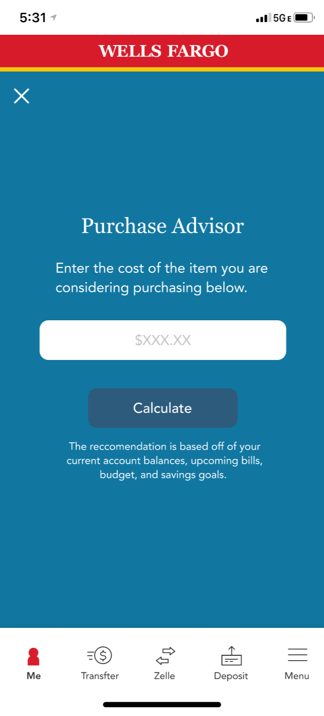
Purchase Advisor is a new feature inspired by research that showed the majority of users check their banking app before making a large purchase. This feature helps the user determine how this purchase would impact their finances and recommends whether or not to make the purchase.

Process
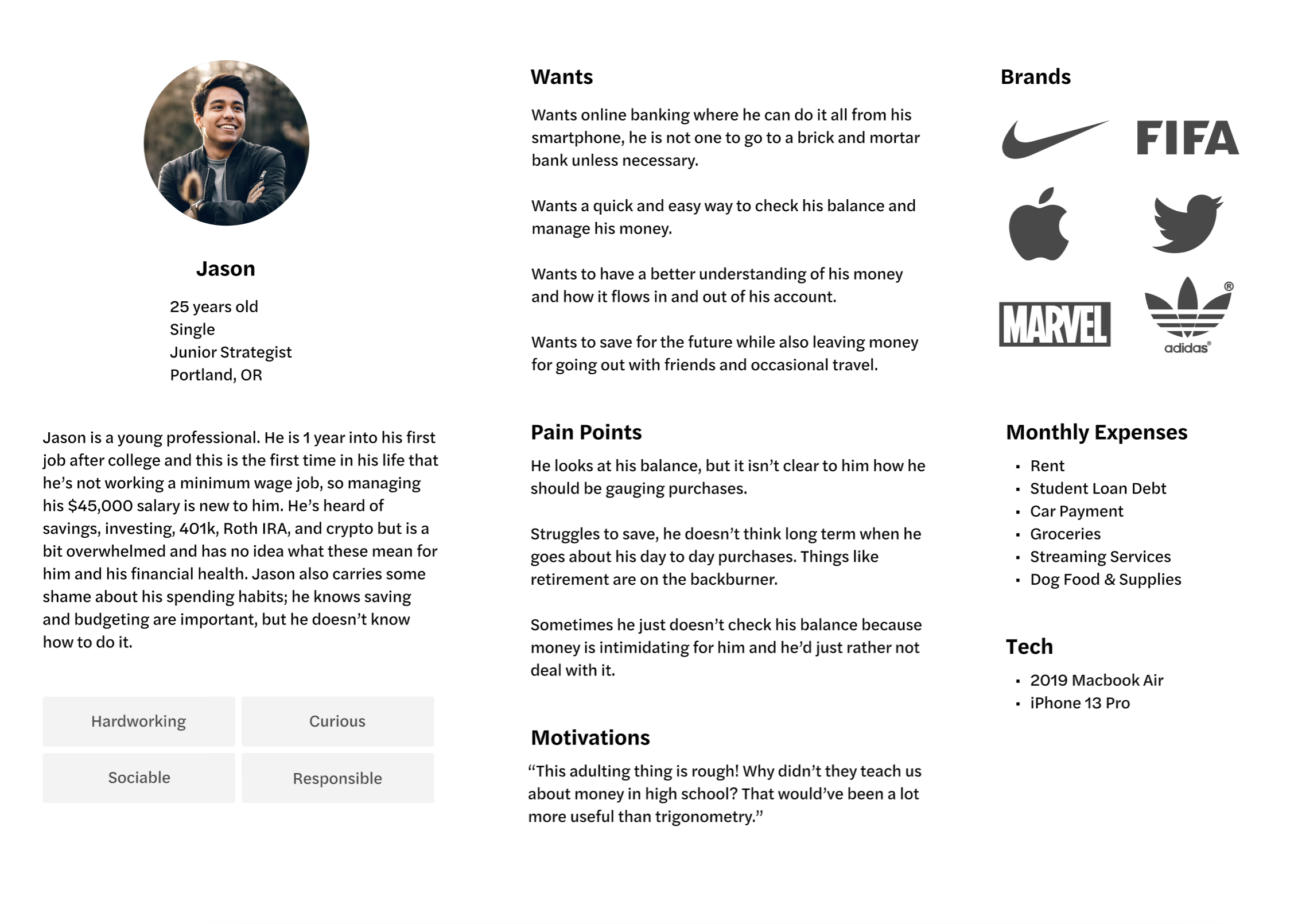
I started with secondary research about mobile banking & millenials’/gen z’s feelings about money. I used this information to create a user persona to guide the project. This research also informed the concepts for different features.
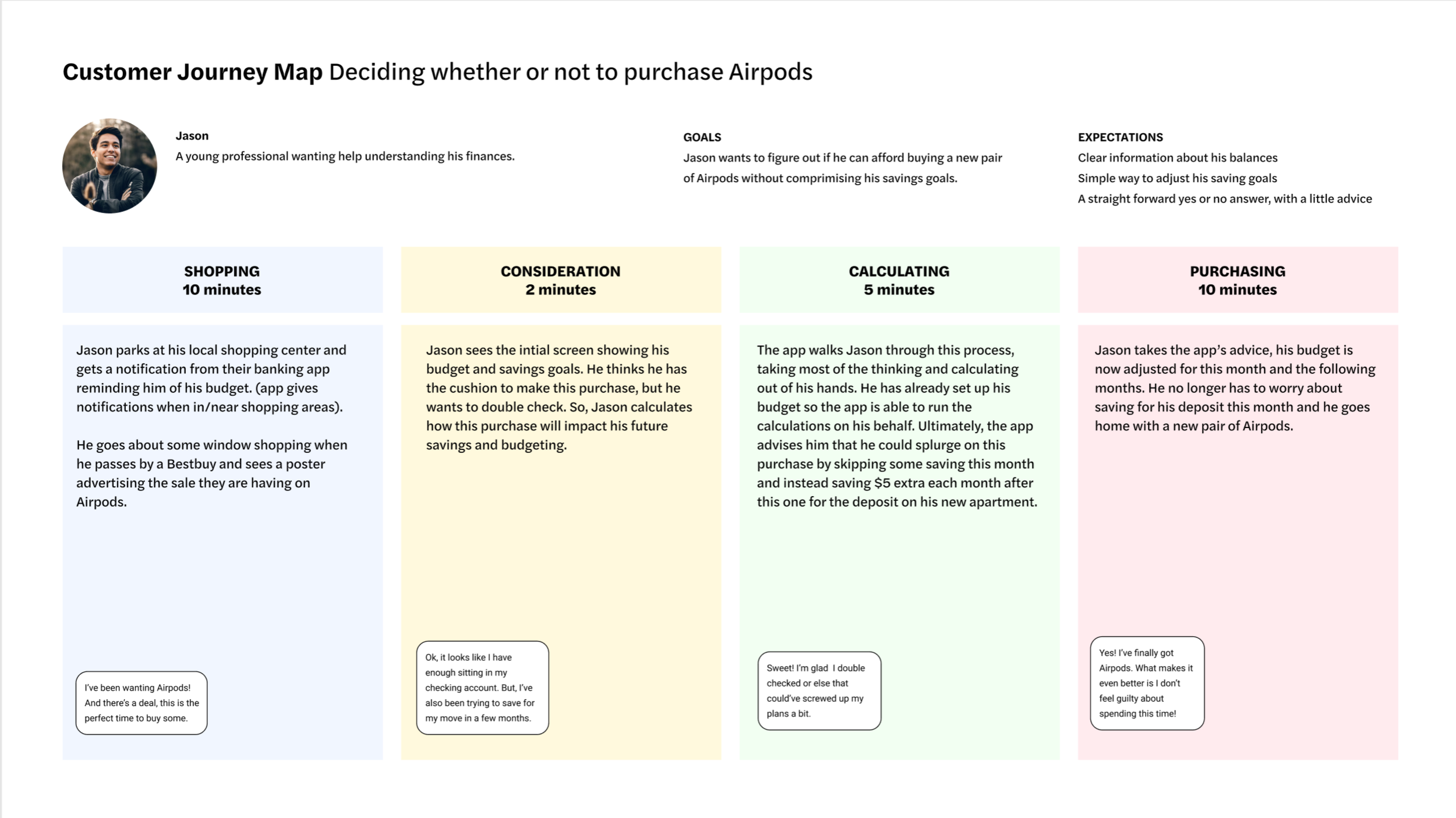
I then constructed a user journey for my persona. This gave use cases for these new features.

Homepage
current redesign
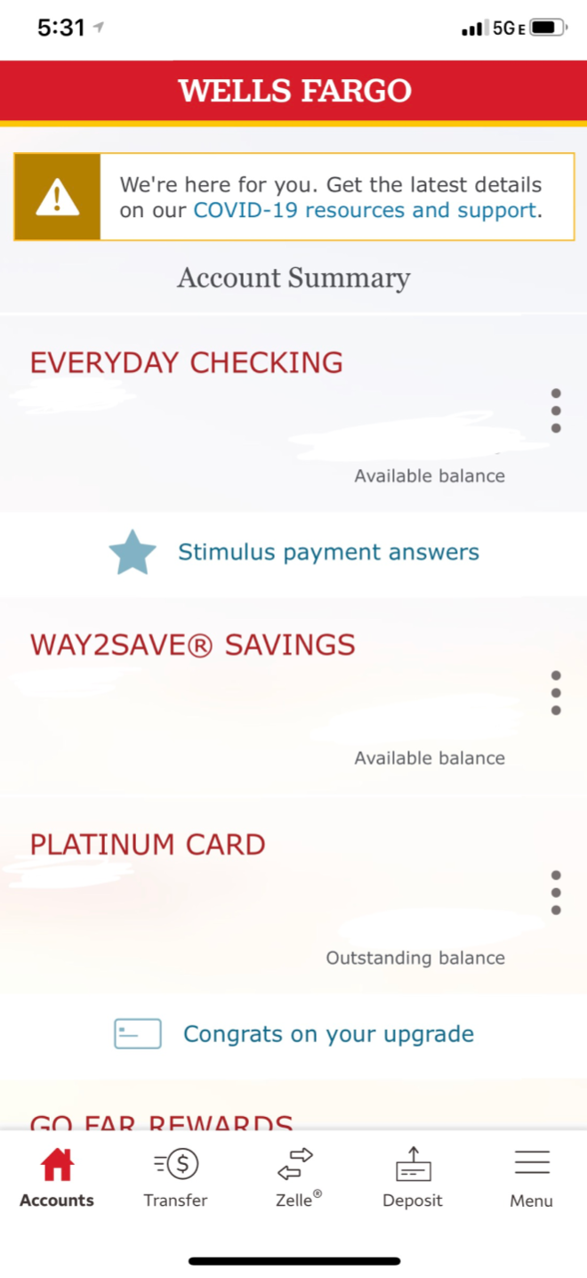

The account summary was condensed to allow for more information on the home screen and a quicker glance at all of the balances.
An upcoming bills section was added to put more emphasis on budgeting and thinking ahead.
The FICO score section was expanded and the information was put on the home screen instead of requiring a tap to view.
current

redesign

A tabbing system was used to allow quick access to budgeting on the home page.
The original app does not have budgeting tools, but it does have a spending report. In the redesign, this is included in “see the breakdown”, but in the context of the created budget.